

Wednesday, July 23, 2014
Thursday, September 12, 2013

Somethings are just better simple


Cartoons are everywhere. In truth this is the best time EVER to get into and start doing cartoons or animation. The web made it possible for everyone to start there own animation and cartoon company. No longer is distribution is a problem. No longer is printing costs a problem. Even the technical issues of shooting animation no longer exists. I remember having to go to the School of Visual arts animation room to do my pencil test and if you wanted to color that was a whole process. Now Flash and After Effects took care of that whole issue. However, one thing I would like to go back in time is the style of animation. But alas, its not just me alone. Cheerios just launched a new ad campaign and new Rocky and Bullwinkle spin off of Mr. Peabody will be released by Dreamworks in 2014. So if you want to get a pulse of where style is going, look no further. I have no doubt that my kids will be asking to me to buy "poodle" skirts and bowling shoes very soon. Gadzooks!
Monday, August 26, 2013
You love Google Doodle, you'll love this!
Yes those Creative Google banners that change all the time has a name. They are part of a division of Google called Google Doodle and people actually get paid for this! So once you fully absorbed that fact, you can actually check out that place on the web and let the reality of your boring job and these amazing illustrations soak into your subconscious. To make things easier I am posting a link to that magical site and you can oogle over google doodle :)
http://www.google.com/doodles/200th-anniversary-of-grimms-fairy-tales


.jpeg)
http://www.google.com/doodles/200th-anniversary-of-grimms-fairy-tales


.jpeg)
Sunday, August 4, 2013
Overlays you will luv!!!


He has the cute video as well.
Monday, July 1, 2013
FF First Cover
Raw Foods. Not such a topic that might temp the tummys of the average FF or Mag reader. Chasidish women in Williamsburg. Again, not the mecca of trend setting locals. However, blend them together it makes for a very fasinating subject on Raw foods that has changed the lives of many in a community very steeped in their kishka and chicken liver.


So I had this idea. Since its about changing the face of Williamsburg, from old to new. Capture this idea from a product point of you. Since the only whisky I drink is Old Williamsburg I am familiar with the bottle. So the idea was to change something to reflect the idea of changing something from the old to the new. So I took the photos which resulted in the pic on the right. Needed to photoshop (left) it a bit and it became the cover.
I had many design issues with this cover. I hope some message was carried across to the viewer. What was your feeling?


Thanks to Cellar 18 of RBS for the bottle (hic)
Sunday, June 30, 2013
Monsters University Character Design

Summer is out and so are the advertisements for summer movies. One animated cartoon to note, Monsters University. From the poster advertisements or the movie (i wont tell) you will see the end product rendered in 3D. If you ever wondered how these characters come to life before 3D you must check out Chris Sasaki blog. This is a behind the scenes look of the characters before they get rendered and a interesting insight on the man who made some of it happen.
Enjoy and learn!
http://sakiteriyaki.blogspot.co.il/
Monday, June 17, 2013
Some inspiration
We are always looking around from some new stuff. GrainEdit is a great site to pick up on ideas about inspiration and just some nice eye candy. Take a look at these covers. You might be seeing something like it in Mishpacha soon http://grainedit.com/2013/05/28/ariane-spanier/


Another Leak
Mishpacha magazine has done some extensive research on government leaks from Binyamin Rose in issue 464. The inside article is very dramatic and was put together proper by Simi Feld. I saw the whole layout and its worth getting the magazine just for this. I can say this because I saw the whole thing, more than that I can't tell you unless its for the right price. What I will do is show you the opening spread. If I show you any-more I might have to take flight to Hong Kong and go incognito.
 Creative Direction: Menachem Weinreb
Graphic Design: Simi Feld
Production: Faigy Hutner
Graphic Design: Simi Feld
Production: Faigy Hutner
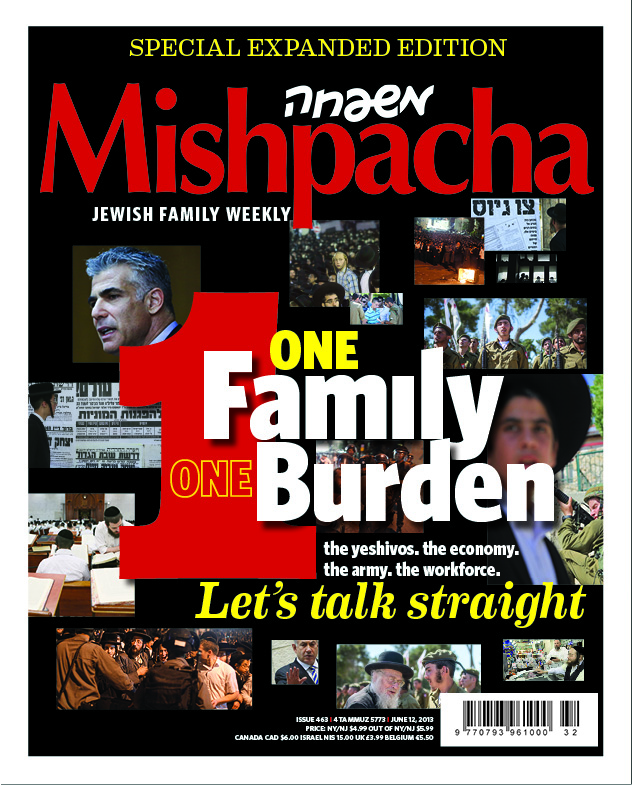
Wednesday, June 12, 2013
Drop Shawdows are Back!?!
I started out designing magazine cover for Mishpacha over four years ago (wow!). Starting out I really never liked the drop shadow effect. It seemed cheap, a gimmick to make things stand out. However, somehow I have become addicted to these drop shadows lately. I think I have to stop. Do you think they add or take away? Would love to hear from you.


Thursday, June 6, 2013
the ghetto chef
Have seen a lot of food magazines lately. Many of the ingredients are hard to get and expensive. Made this real quick. It has mushrooms, plums, and pears to name a few. The whole wheat toasted pita is coated with a basalmic honey combo. I can let u know more, but it was quick, cheap and yummy.


Wednesday, June 5, 2013
Obamacare for idiots?!? I think not
Is Obamacare bad? I must say that it doesn't seem so bad. My ebullient attitude towards this new program based on the great breakdown of the subject. This is due to the great planning of the design of the text and the layout. Very easy to read and comprehend. Thank you Mishpacha
How it was done:
The inspiration of the design was info-graphics. The idea started from the website http://visual.ly/. This is a good resource on how people handle subjects that can be broken down to shape and colors. Visit the page its worth it. It helped us to formulate a design to better understand Obamacare. If that's not greatness, what is...
 Creative Direction: Menachem Weinreb
Graphic Design: Aviva Kohn
Production: Faigy Hutner
How it was done:
The inspiration of the design was info-graphics. The idea started from the website http://visual.ly/. This is a good resource on how people handle subjects that can be broken down to shape and colors. Visit the page its worth it. It helped us to formulate a design to better understand Obamacare. If that's not greatness, what is...

Graphic Design: Aviva Kohn
Production: Faigy Hutner
Sunday, May 19, 2013
Mag 460
Mag 460
The assignment was how to make the Kotel crumble. Its never easy for Mishpacha designers because often are sources are limited to a few photostock sites. The idea of rocks falling from the Kotel is a tuff one because of the size of the stones and the uniqueness of the the type of stones used in the Kotel. Those stomes are hard to find on the stock sites so we needed to create our own.
So how did we get it done.
We needed to start off with a picture of the kotel.


 Creative Direction: Menachem Weinreb
Graphic Design: Simi Feld
Production: Faigy Hutner
The assignment was how to make the Kotel crumble. Its never easy for Mishpacha designers because often are sources are limited to a few photostock sites. The idea of rocks falling from the Kotel is a tuff one because of the size of the stones and the uniqueness of the the type of stones used in the Kotel. Those stomes are hard to find on the stock sites so we needed to create our own.
So how did we get it done.
We needed to start off with a picture of the kotel.

Pretty standard. you can get this off shutterstock. no biggie
Next step is a little tricky. So using some knowledge of CGI graphics. We bought another image

This composite is very similar what you would recreate in a 3D modelling program. However, one problem is that these stones have no texture and the size is not the size of the Kotel stones. So we elongated the image a bit with the photoshop skew tool and then we got some texture from our good friends at textureking.com (a great place for free textures)
So we found a texture that we were able to overlay and then we played around with a few actions and then Volia! the Kotel crumbles at the hands of the Women of the Wall...er...hmmmm. Well, that is not a good thing, but for us at graphics we like the way it came out on such a short time (granted productions definition of short may differ with graphics)

Well hope you liked this like tutorial. If you want to know more. Please come down on any given Sunday and we can teach you how it gets done.
If you cant come heres the cover

Graphic Design: Simi Feld
Production: Faigy Hutner
Monday, December 24, 2012
Tiffany's Brilliant App

Has anyone seen the Tiffany App lately? Well if your like me, you haven't and sure enough its our loss. I don't have a tablet and wish I did just so I can see the brilliant work of Matte Stephens. Tiffany outsourced Matte to design their new holiday season interactive App. Well, if you cant afford the jewellery, take advantage of the game illustrated by Matte Stephens.
http://matteart.blogspot.co.il/2012/11/i-had-pleasure-of-working-with-tiffany.html
Thursday, December 20, 2012
Nano Nano
I must write this and you must know. I dont care where you are and what you know about graphics. This week Mishpacha put out the phatest, article ever! I can't say enough.. It deserves an award in some type of journal. You know, I think we should enter this somewhere...Its awsome. Simi Feld took this piece to another level.


{click to enlarge}
Creative Direction: Menachem Weinreb
Graphic Artist: Simi Field
Production: Faigy Hutner
On the Cutting Room Floor, Part One
Flashback, Family First 320. Everyone loved the picture that appeared on cover. It was taken by Jolee Photography, nice! What the people out there do not know is that it wasn't the only option. While making the cover, we often agonize over what is the best picture to use that will best represent the article. FYI, the most challenging covers are the holiday covers. Since the amount of stock Jewish Holiday are limited, we often have to be more creative and yes, sometimes dish out some cash for special photo shoots So in this case find below some other options. Did we make the right choice?


(click to enlarge)
Biased I am, the kid on the right is my son. Otherwise,I love them both!!!
HAPPY HOLIDAYS (I'm refering to Chanukah, Oy Oy Oy)
Tuesday, December 18, 2012
Picassos Blue Period

"Hey, I'z no dummy. One of dem pictures is not a Picasso" you might be saying. True my friend, you are correct. What these pictures do have in common is that they all have a under lying color of blue. Most pictures coming in through a digital camera will have a blue tinge. It is hard to notice, but when taken out, the difference becomes much more apparent So when working on images, especially that go to print you must take out the blue.
How its done:
Its quite simple. In Photoshop while working in RGB, go to the Curve channel. In the Curves menu, select the blue Channel. After that, lower the blue, and you will 9 out of 10 times see a world of difference on the screen. With such a method you will see a great difference in the printed picture. If this is not done then the pictures usually print as if the subject has a blue overlay.
Leave the Blue Peroid to Picasso and keep your pictures more alive and realistic. I will thank you and so will will Pablo for not trying to rip him off. Adios!
P.S. I forgot to take the blue out of the picture on the cover, it could have that much better. :-(
Monday, December 17, 2012
who needs gettyimages...we do!!! (maybe)

A great place to get some inspiration is gettyimages.com. Pricey, but certainly the address to see some very creative images taken by today's top stock photographers. For the cover for FF 321 we needed to find the right picture that had the right mood. We found a picture on Getty that seemed to have the right blend of lighting and color, but something wasn't really working (picture on right). So we, at the graphic hub, put on our thinking caps ( mine happened to be surprisingly rather new, barely used in elementary school) and put together our our photo shoot This resulted in in this weeks cover. Special thanks for Brachi Rosenes to help out and making this happen

Creative Direction: Menachem Weinreb
Photo Stylists: Brachi Rosenes, Aviva Kohn, Simi Field, Leah Pinsky
Production: Faigy Hutner
Wednesday, November 14, 2012
Pray for the Victims of Sandy
I think hurricane Sandy not only effected those in the States, I feel like I have be effected as well. Swept up in an under current of news stories and personal tales I have been very involved. My heart goes out to the real victims. Now most people are getting back to normal, I need to get back as well. Need to get back into it, need to finish the illustrations. I have Part 2 of Rabbi Yeshoua Ben Lavi almost done with a side bar on vows and what is a valid vow and what isn't. Well, if you dont like that, the story is great anyway. I hope to be done at the end of the week. Pray for me


Monday, November 12, 2012
Sol Linero illustrator

but even if u don't have an opinion, you'll love these illustrations. http://www.sollinero.com/
Subscribe to:
Posts (Atom)