Wednesday, September 12, 2012
New Year and New Kolmus
This year will end with the old look and begin with the new look of Kolmus. With a dedicated readership how do you carefully evolve the look of the brand to better represent its place in the market and maintain a contemporary image? With a limited time frame we were tasked to produce this redesign In house. Special thanks to Nomee Shaingarten and Hila Friedman for believing in this new vision and new look, while still keeping the Kolmus image
Monday, September 3, 2012
Cover(s) of the day
The nation is over due for a new facelift. Mishpacha and Huffington post gave there first makeovers on the man set to change the face of the nation. Will he win? People are still convinced that prez Barack Hussein Obama still has a better chance to retain his position. Since election day is a bit far off. Take the time and vote on whether Mishpacha cover is a winner vs. Huffington post. What do you think?
Monday, August 27, 2012
Vacation is out
Welcome back to reality. Vacation time is over and we are settling back into our routines. Hears a last taste of summer as it slowly fades into the deep recesses of the mind. Very creative cover, very creative picture.
Sunday, August 12, 2012
Great vacation great inspiration
What inspires you. A book, a place maybe a song. During this vacation try to take a slice of life and bring it back and have it reflect on your work. Share it with others. It will inspire. Send me some of your photos, we will post.
I took some photos of the the Shuk in jerusalem enjoy!
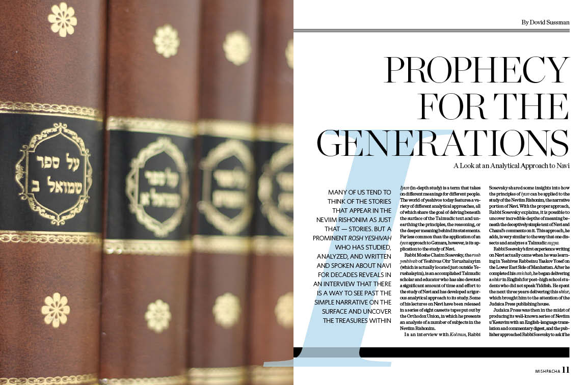
Mag 421/ FF 303
A couple of spread were worth noting that went to print last week. I know that its the summer and everyone is different schedules and trying to keep it together. Please take note of some spreads that were very inspiring from a graphic standpoint. If you dont have time to read, no mind, I dont have the patience to write.
Sit back and take in the color and enjoy
Monday, August 6, 2012
A picture is worth a thousand bucks
"What can be so hard about taking a picture?" you might say (don't). In the case of Meit Haltovsky, he makes it seem that easy. In reality a good photographer is making Mishpacha look like a million...no...a billion bucks! Compare and look around. See what images are being taken for other publications, then come back to Mishpacha. See the difference. I do every week.
Thursday, August 2, 2012
Keep your palette simple
Because I had the chance to do some illustrations in the upcoming Magazine heres a quick tip. Of course there is a general excitement to use many of the colors that come with a beginners paint set. Burnt Umber, Raw Umber, Cobalt Blue, Red Crimson, as well as the basic colors of yellow, orange, and red. However, while approaching illustration keep your colors limited to three or four colors. Too many colors will be confusing and hard to balance on the canvas or computer screen. A good example, take a look at Monets paintings and see similar color palette is carried through the painting. Certainly there is room for dabs of accent colors, but the base should be limited and simple.
Below find some examples of Monets paintings
Subscribe to:
Posts (Atom)


