Monday, December 24, 2012

Tiffany's Brilliant App


Has anyone seen the Tiffany App lately? Well if your like me, you haven't and sure enough its our loss. I don't have a tablet and wish I did just so I can see the brilliant work of Matte Stephens. Tiffany outsourced Matte to design their new holiday season interactive App. Well, if you cant afford the jewellery, take advantage of the game illustrated by Matte Stephens.

http://matteart.blogspot.co.il/2012/11/i-had-pleasure-of-working-with-tiffany.html

Thursday, December 20, 2012

Nano Nano

I must write this and you must know.  I dont care where you are and what you know about graphics. This week Mishpacha put out the phatest, article ever! I can't say enough.. It deserves an award in some type of journal. You know, I think we should enter this somewhere...Its awsome. Simi Feld took this piece to another level.
{click to enlarge}


Creative Direction: Menachem Weinreb
Graphic Artist: Simi Field
Production: Faigy Hutner


On the Cutting Room Floor, Part One

Flashback, Family First 320. Everyone loved the picture that appeared on cover. It was taken by Jolee Photography, nice! What the people out there do not know is that it wasn't the only option. While making the cover, we often agonize over what is the best picture to use that will best represent the article. FYI, the most challenging covers are the holiday covers. Since the amount of stock Jewish Holiday are limited,  we often have to be more creative and yes, sometimes dish out some cash for special photo shoots  So in this case find below some other options. Did we make the right choice? 

(click to enlarge)

Biased I am, the kid on the right is my son. Otherwise,I love them both!!! 

HAPPY HOLIDAYS (I'm refering to Chanukah, Oy Oy Oy)

Tuesday, December 18, 2012

Picassos Blue Period


"Hey, I'z no dummy. One of dem pictures is not a Picasso" you might be saying. True my friend, you are correct. What these pictures do have in common is that they all have a under lying color of blue. Most pictures coming in through a digital camera will have a blue tinge. It is hard to notice, but when taken out, the difference becomes much more apparent  So when working on images, especially that go to print you must take out the blue.

How its done:
Its quite simple. In Photoshop while working in RGB, go to the Curve channel. In the Curves menu, select the blue Channel. After that, lower the blue, and you will 9 out of 10 times see a world of difference on the screen. With such a method you will see a great difference in the printed picture. If this is not done then the pictures usually print as if the subject has a blue overlay.

Leave the Blue Peroid to Picasso and keep your pictures more alive and realistic. I will thank you and so will will Pablo for not trying to rip him off. Adios!

P.S. I forgot to take the blue out of the picture on the cover, it could have that much better. :-(

Monday, December 17, 2012

who needs gettyimages...we do!!! (maybe)


A great place to get some inspiration is gettyimages.com.  Pricey, but certainly the address to see some very creative images taken by today's top stock photographers. For the cover for FF 321 we needed to find the right picture that had the right mood. We found a picture on Getty that seemed to have the right blend of lighting and color, but something wasn't really working (picture on right). So we, at the graphic hub,  put on our thinking caps ( mine happened to be surprisingly rather new, barely used in elementary school) and put together our our photo shoot  This resulted in  in this weeks cover. Special thanks for Brachi Rosenes to help out and making this happen


Creative Direction: Menachem Weinreb
Photo Stylists: Brachi Rosenes, Aviva Kohn, Simi Field, Leah Pinsky
Production: Faigy Hutner


Wednesday, November 14, 2012

Pray for the Victims of Sandy

I think hurricane Sandy not only effected those in the States, I feel like I have be effected as well. Swept up in an under current of news stories and personal tales I have been very involved. My heart goes out to the real victims. Now most people are getting back to normal, I need to get back as well. Need to get back into it, need to finish the illustrations. I have Part 2 of Rabbi Yeshoua Ben Lavi almost done with a side bar on vows and what is a valid vow and what isn't. Well, if you dont like that, the story is great anyway. I hope to be done at the end of the week. Pray for me


Monday, November 12, 2012

Sol Linero illustrator

Take a look at the last post. Now take a look at this illustrator site and style. Could this style work for Info-graphics  If so, why? Or why not?

but even if u don't have an opinion, you'll love these illustrations. http://www.sollinero.com/


Let the graphics hit 'em


Happy to see that Mishpacha Magazine is making the strong move towards more Infographics. With the demise of Good Magazine, a former leader in offering infographics, Mishpacha is picking up the slack and offering more informational eye-candy. Two great examples of this, power outage article and one other in the election supplement. I know this is just a sampling of what we are going to see in the future. For those that want to expand there minds a bit further see what my friends at  http://visual.ly/ are producing daily.


Creative Direction: Menachem Weinreb
Graphic Design: Simi Feld


Monday, November 5, 2012

How I'm supposed to feel?


Included in this post, a cover from the New Yorker. Interesting  like all New Yorker covers. However, is it on target for the feelings of the people of America? The people of New York?. Maybe, I don't  know. I guess if it has to be explained I just missed the point. What I do know is that late on Sunday I received one of the best titles for a cover that matched the picture. No, the story about the hurricane is not new, we are not exposing a new story. We are all too aware of many details of this event found on the Internet , print and stories told by family and friends. What is often hard to formulate is the overall impact of such an event. How are we supposed to feel? I'm not telling you how to feel, I'm just telling you to look at the magazine cover. Take it from there


Tuesday, October 30, 2012

remember me?

Hi

Its been waaaaaay too long since the last post. Some nice stuff has been layed out for the magazine in the past few weeks, but that's water under the bridge for now (we are thinking of u NY!!!, stay safe).

Something happened last sunday. But first, let me take you back to Thursday where are story begins.

Thursday October 25
 It seemed like we had a cover story, some fantastic pictures from Meir from the States, my job on Sunday was looking real easy.

Shabbos October 27:

On Shabbos someone asked me if stories ever change on Sunday, I told him it happens, but its rare.
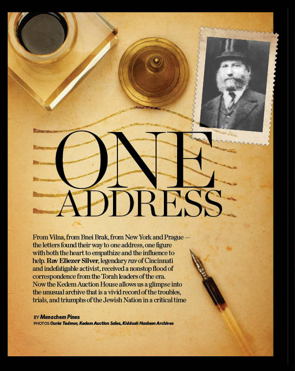
Sunday October 28
Surprise! We have a new cover story and a whole story to be layed out. Its a concept cover, which usually takes more thought. The article is long and a bit complicated. Oh, did I mention, we didnt even have a cover for the family first as well. (yikes!!!!)

So what happened. Well the graphic team really stepped it up (as well as everyone else) and did some really nice work. The day was long, but not longer than any other sunday. So hats off to all the Mishpacha team for a great job. Here included are some of the work included.


Oh, by the way. Rebbitzen Pinsky when you have a chance, we found your sidder

Wednesday, September 12, 2012

New Year and New Kolmus


This year will end with the old look and begin with the new look of Kolmus. With a dedicated readership how do you carefully evolve the look of the brand to better represent its place in the market and maintain a contemporary image? With a limited time frame we were  tasked to produce this redesign In house. Special thanks to Nomee Shaingarten and Hila Friedman for believing in this new vision and new look, while still keeping the Kolmus image

Monday, September 3, 2012

Cover(s) of the day


The nation is over due for a new facelift. Mishpacha and Huffington post gave there first makeovers on the man set to change the face of the nation. Will he win? People are still convinced that prez Barack Hussein Obama still has a better chance to retain his position. Since election day is a bit far off. Take the time and vote on whether Mishpacha cover is a winner vs. Huffington post. What do you think?

Monday, August 27, 2012

Vacation is out


Welcome back to reality. Vacation time is over and we are settling back into our routines. Hears a last taste of summer as it slowly fades into the deep recesses of the mind. Very creative cover, very creative picture.

Sunday, August 12, 2012

Great vacation great inspiration


What inspires you. A book, a place maybe a song. During this vacation try to take a slice of life and bring it back and have it reflect on your work. Share it with others. It will inspire. Send me some of your photos, we will post.

I took some photos of the the Shuk in jerusalem enjoy!

Mag 421/ FF 303

A couple of spread were worth noting that went to print last week. I know that its the summer and everyone is different schedules and trying to keep it together. Please take note of some spreads that were very inspiring from a graphic standpoint. If you dont have time to read, no mind, I dont have the patience to write.

Sit back and take in the color and enjoy


Monday, August 6, 2012

A picture is worth a thousand bucks

"What can be so hard about taking a picture?" you might say (don't).  In the case of Meit Haltovsky, he makes it seem that easy. In reality a good photographer is making Mishpacha look like a million...no...a billion bucks! Compare and look around. See what images are being taken for other publications, then come back to Mishpacha. See the difference. I do every week.


Thursday, August 2, 2012

Keep your palette simple


Because I had the chance to do some illustrations in the upcoming Magazine heres a quick tip.  Of course there is a general excitement to use many of the colors that come with a beginners paint set. Burnt Umber, Raw Umber, Cobalt Blue, Red Crimson, as well as the basic colors of yellow, orange, and red. However, while approaching illustration keep your colors limited to three or four colors. Too many colors will be confusing and hard to balance on the canvas or computer screen. A good example, take a look at Monets paintings and see similar color palette is carried through the painting. Certainly there is room for dabs of accent colors, but the base should be limited and simple.

Below find some examples of Monets paintings


Wednesday, August 1, 2012

Celiac: A design Story


How it all started. Let me tell you a story about the day in the life of the design

Make a layout about Celiac, a in-depth article from Riva Pomerantz (spelled correctly). Quite a daunting task.Its very hard to make a nice design on a health piece. Many times the medical layouts look to techy, something more appropo for a medical journal rather than a womans weekly After some discussion with the editor the graphic designer found this image to match the article on Google images. Doing a search for Celiac, yielded this result.
Nice picture and good photography. The challenge was how can we do such a picture. So the next day we took some pictures of three wonderful children from Beit Shemesh (all with working papers) and it resulted in these pictures
Pictures were then brought back to Mishpacha studios where the graphic designer played with the image and created depth by adding an image found on Shutterstock
After some lighting changes and actions in Photoshop, the result was a very, original, and strong opening for a Family First article. Real thanks to the Editors (Bassi and Shana) thanks for supporting this, the Creative Director(me), the graphic designer (Leah Pinsky) and the little Elfs of Beit Shemesh. 


Wednesday, July 25, 2012

Give me a hand

Searching for images on shutterstock is not as easy as it looks. While doing a article on comforting mourners we needed to get an image of hands. Most of the images on Shutterstock are of adult hands with children, or adult hands clasping the hands of the elderly. So we took some pictures in-house and got some nice results. More than anything, I hope that the article was important that it will help others be able to do this Mitzvah Mehadrim Min'Hamadrin.

Thank you for all those who made this possible

photoshop barn burner

Another happy day in Mishpacha Land. With the coming of FF 300 published, came a great photoshop montage. Certainly a difficult task made easy with some strong photoshop skills made this layout a true winner. Critics may have there say and think that this looked too old. I do hear that argument ,there is a certain vintage tinge to the layout, but I think it works with this article. You can almost smell the mothballs.

Tuesday, July 24, 2012

seeing the great in others

Question, could you start a new blog during the 9 days? Before you think that this is another bad 9 day joke, think. The idea of the blog is to bring people together of different backgrounds, opinions, and tastes. Once we are cognizant of our different talents we can compliment each other. We were given gifts, then others are given gifts, different, but beautiful gifts. Build ourselves, build our neighbour, build the Beis HaMikdash.

In this new site you are able to send comments, test it, let me know if it works. Click on the (no) commment bar at the bottom of the post, it should work


Sunday, July 15, 2012

Trifecta


A special hats off to the design team on FF 299. Three different features each approached with a unique handling and equal effective graphics. Each layout had mucho merit and stood as a good example of pushing design styles.

The holocaust piece was special because it took an otherwise impossible concept and turned it into something magical. You try making a turnip look threatening! 

The autism,  a creative way to approach a collage and tie it into a concept. Thank you Rabbi Galinsky for letting us use the picture, no fake ID here, but it always helps to get the blessing of the Rabbi...

The foraging was done on a white background which gave the overall magazine much balence, much contrast, between the other pieces. Also the different sized teasers (pull quotes) were also a very nice creative flair.
Overall this was the strongest 3 features done to date, a true trifecta!!!
BTW, PT Sans will return, coming soon!